Zuba
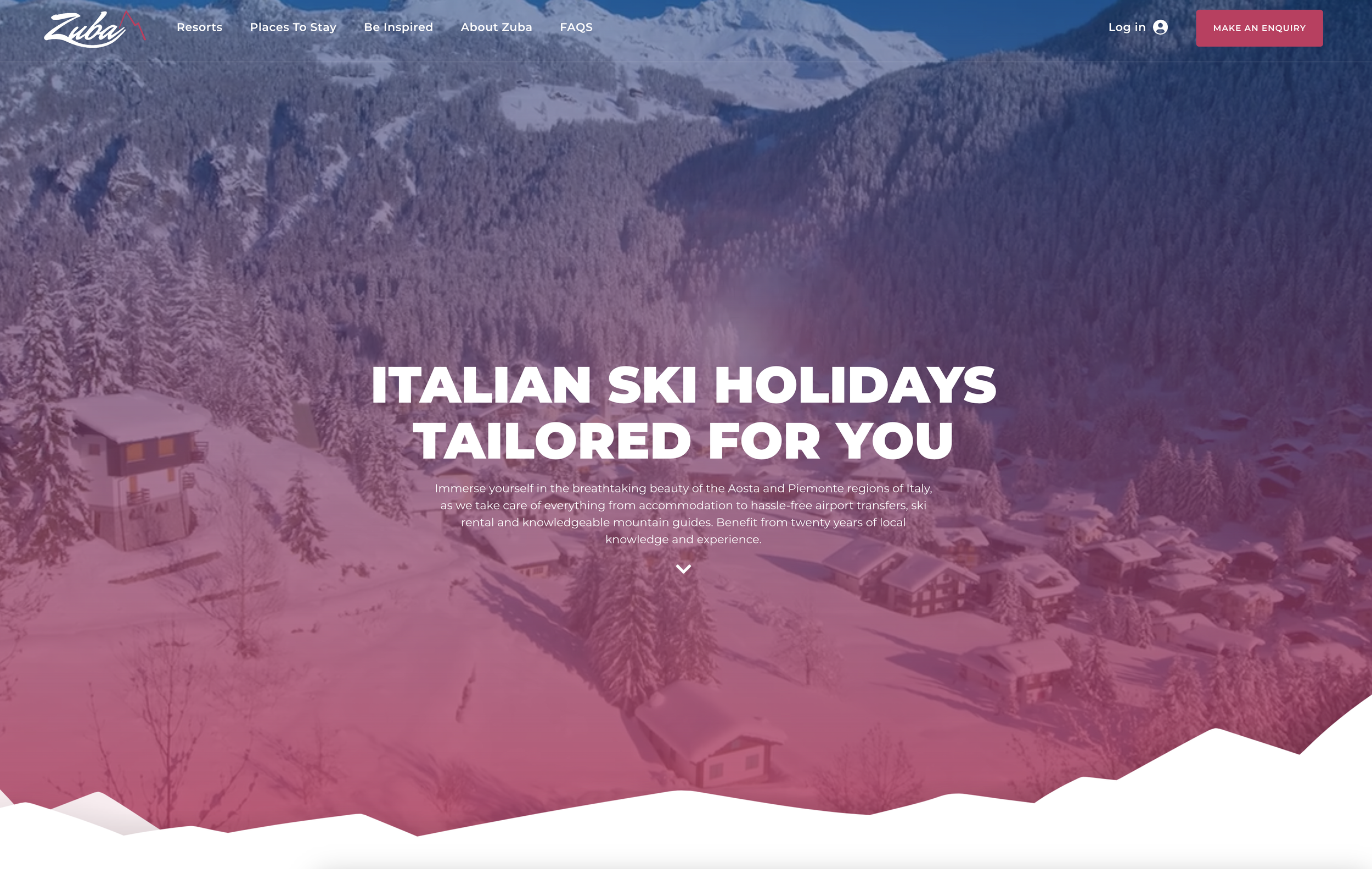
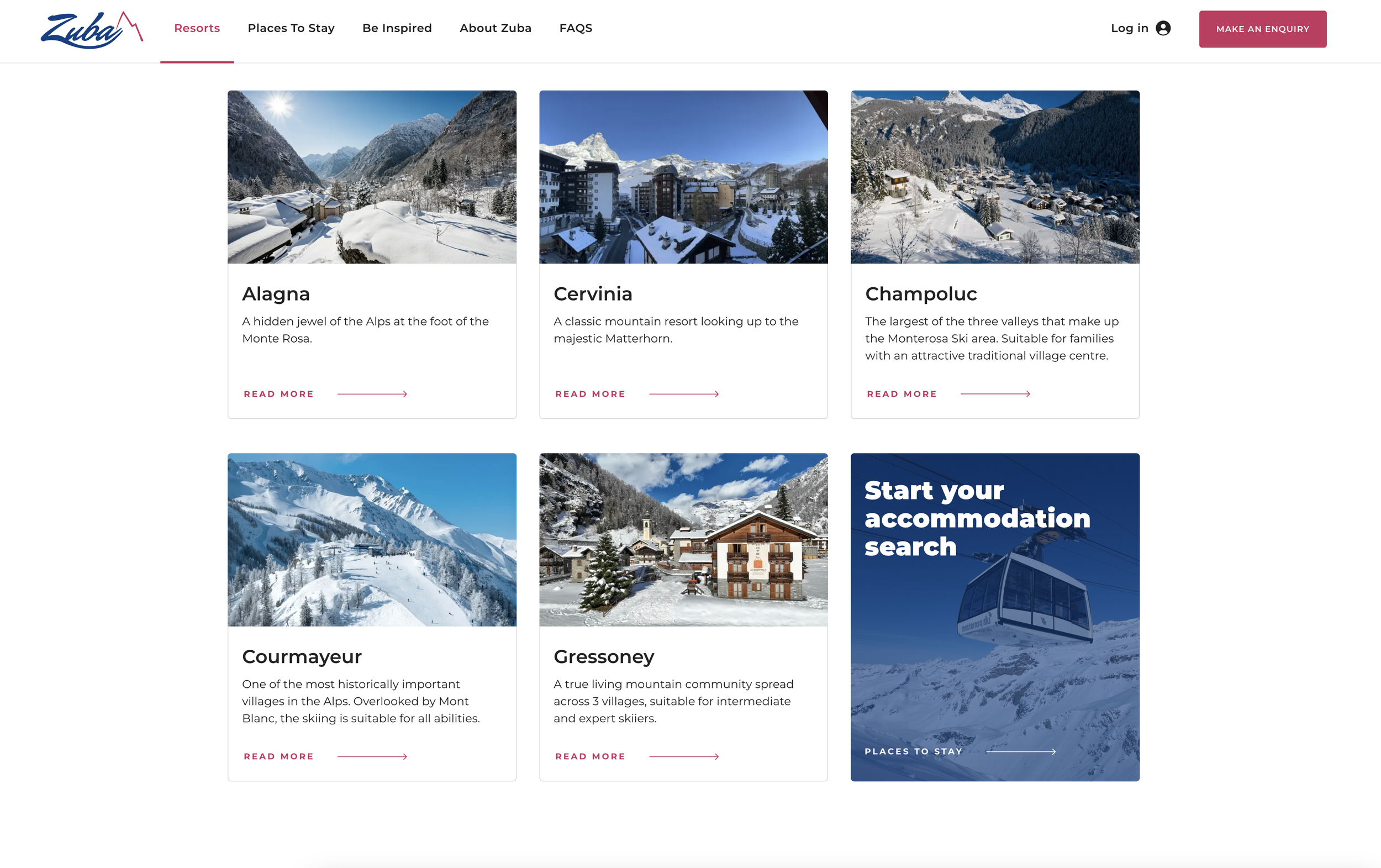
Zuba has been working in the Alps since 2003. Originally set up in the Monterosa Ski Area and the small resort of Alagna, Italy. They have since grown the business to operate throughout Italy’s Aosta valley to include the resorts of Alagna, Cervinia, Champoluc, Courmayeur and Gressoney. Their objective is to search out and find small resorts in the Alps that offer great tradition, great character and great skiing.
Visit the Zuba website at: www.zubaski.com
The Challenge
The Summit team were given a brief from Zuba to refresh their current branding and to update their website to reflect this, after being closed since Covid.
Branding
When redesigning the branding for Zuba, the Summit Team began by reviewing the current logo and brand colours. We decided to keep one of the existing brand colours, blue, but added the pink to reflect the colour the sky turns in the Monterosa region at the end of the day.
With the relaunch, we thought it would be as good as time as any to freshen up the logo. The idea behind the new logo was to introduce fluidity, compared to the existing, angular logo, and to incorporate skis where the Z and A ‘flick’. We feel this new logo reflects the Alpine look and feel that you look forward to when going on a ski trip, and takes your mind straight to the mountains.
Throughout the process, we came to the decision, with the Zuba Team, to strip back the brand name to just ‘Zuba’ from ‘Zuba Ski’, to again bring Zuba up to date.
The Digital Application
The Zuba website was developed on Webflow due to its superior performance, rapid construction pace, and the client's preference for straightforward website editing.
The digital application of this project included integrating the Zuba booking and enquiry system into the website. The built in enquiry form was unique in a few ways: it was simplified from the current form, making it easier for customers to define the guests for the trip and the type of accommodation needed, the enquiry form also pops up with further recomendations of places to stay, and we optimised the performance of the form due to it having a significant amount of data to load and store.
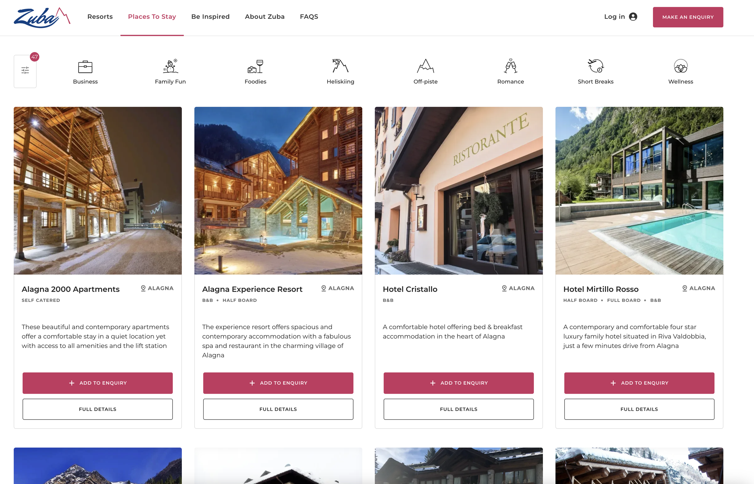
Within the “Places to Stay” section of the website, we followed Webflow best practices to create a filter to categorise the accommodation on offer. We did this using Webflow CMS Collections and integrated Finsweet Attributes.
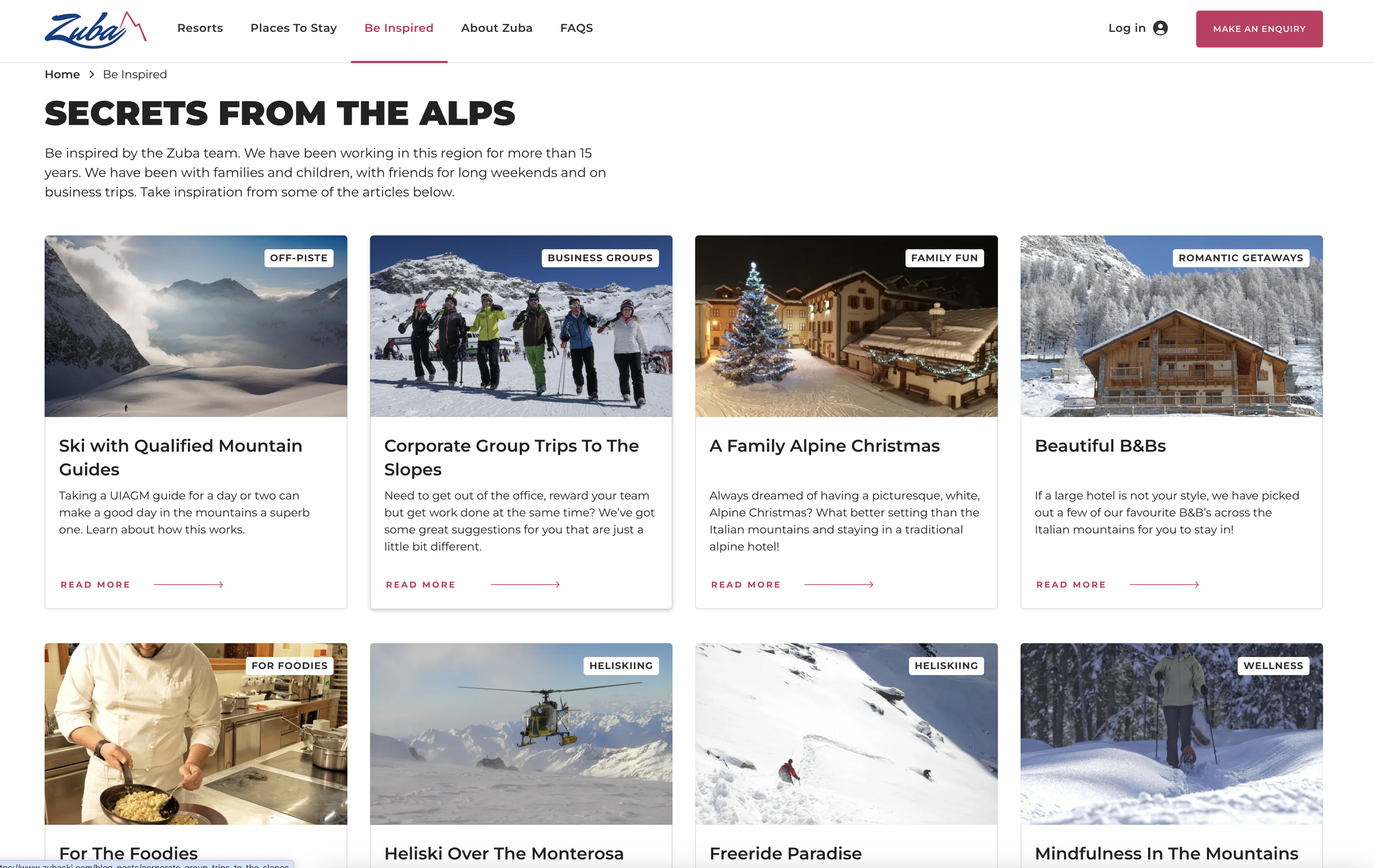
We wanted the user journey to be as simple as possible and inspiring to those booking their ski trip, so we added a “Be Inspired” section for blog posts and to help our customers find accommodation for the type of ski holiday they are going on, whether that is a corporate holiday, a short break or a family trip.
Marketing Activity
The Summit Team are involved in all the on-going marketing activity for Zuba, including writing blogs, creating email campaigns and running their social media marketing activity (which is making us desperately want to escape to the mountains)! Zuba have amazing photos from the mountains and all of their partner accommodations which you can take a look at on their Instagram, Facebook, LinkedIn or X profiles - which may make you want to run off to the mountains as well!
The Results
Once the website was up and running, we ran a report on the Zuba website and below are the results.
We couldn’t be more pleased with the results Zuba is getting for Accessibility, Best Practices and SEO!


